In today’s data-driven world, organisations generate and collect data at unprecedented speed. Yet raw data alone rarely leads to better decisions. It is only when data is transformed into something clear, relevant, and contextual that it becomes truly useful. Dashboards play a crucial role in this process.
A well-designed dashboard is much more than a collection of graphs. It is a powerful communication tool that helps people see patterns, spot issues, and take action. Whether you’re working in traffic planning, business operations, or urban development, the core principles of good dashboard design remain the same.
In this article, we’ll walk through the complete process of creating an effective dashboard.
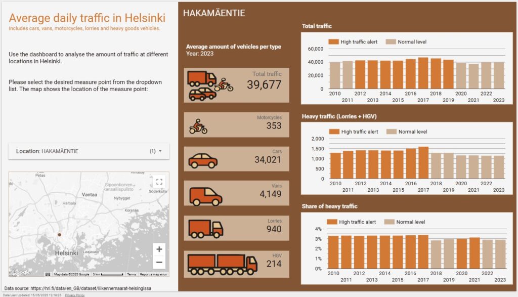
We will use this dashboard, based on open data from the Helsinki Region Infoshare, as an example. The dashboard visualises traffic data from 56 measure points in Helsinki over the years 2010-2023. This dashboard was created for training purposes and is a very simple version of a dashboard. It is, for instance, based on yearly data whereas a real life traffic dashboard would be based on live data. It is also created on a subset of the data in order for it to serve the purpose of the training session. Nevertheless, it demonstrates many important features of a well-functioning dashboard and you can see how the advice in this article is implemented.
In this article you’ll learn how to define goals, prepare and visualise your data, design for clarity, and build a tool that turns data into action.
Start with a clear purpose
Before you start building, define the core objective of the dashboard:
- Who will use it?
- What question(s) should this dashboard answer?
- What decisions should it support?
Knowing your audience is essential. Traffic dashboards could be used by operational traffic planners, urban designers, or policymakers. But a strategic dashboard for the city executives will look very different from an operational dashboard for traffic engineers.
So unless you are very familiar with the use case yourself you need to interview the future users. Find out what questions they are faced with in their job and what decisions they need to be able to take based on the data in the dashboard.
Note: For this training dashboard, no actual traffic planners were interviewed as it is created only for demo purposes.
Know what to measure
Once the goal is clear, identify the key metrics. Don’t try to show everything at once. Instead, focus on what helps users act. Choose a handful of metrics, not ten or twenty.
For a traffic planner’s dashboard, useful metrics might include:
- Total vehicle counts by year and location
- Share of heavy vehicles (e.g., lorries, buses)
- Traffic levels compared to predefined thresholds
Also consider thresholds (i.e. predefined reference values that help flag when something is unusually high or low) if such are readily available or can be deduced from the data. With thresholds you can highlight data that exceeds a level that should trigger action. And using colour-coding to mark the observations that are above the limit makes them easy to notice. On our traffic dashboard traffic levels over the thresholds are painted orange, whereas normal levels are grey.
Clean and prepare your data
A dashboard is only as good as the data behind it. That’s why data preparation is one of the most important steps:
- Source reliable data: Use high-quality open data or validated internal datasets. For our traffic planning dashboard we used open data from Helsinki Region Infoshare. The threshold data, however, is not real, but fabricated for demo purposes.
- Clean the data: Remove duplicates, correct errors, handle missing values, and check for outliers. While doing this, you will also get to know the data; what variables there are and what values they have. This will help you choose good key metrics and decide how to visualise them.
- Aggregate where needed: If you already know how you want to present the data, for example, by annual averages or vehicle counts by category, it’s best to prepare those summaries in advance. Pre-aggregating your data means the dashboard doesn’t have to calculate everything on the fly, which helps it load faster and perform more smoothly. Relying on live calculations can slow down chart rendering, especially with large datasets.
- Align sources: If you are combining datasets (e.g., weather and traffic), make sure time formats, locations, and units match. For the traffic dashboard we combined the dataset with the thresholds with the traffic data dataset using the unique codes for each measure point.
Preparing the data can feel tedious and take a long time, but it is time well spent. Clean, well-structured data is the foundation for any reliable dashboard. Without it, you risk showing misleading results or running into small issues that make the dashboard harder to trust. Ensuring the data quality right from the start means the rest of the process runs more smoothly. The final dashboard will also be more useful and provide better answers when the underlying data is accurate.
Choose the right tools
Choose a dashboarding platform that fits both your data and your users. The right tool depends on what kind of data you’re working with, how you plan to share the dashboard, and what features your audience needs.
Some commonly used tools include:
- Looker Studio (formerly Google Data Studio): A free and user-friendly option that is best for lightweight, web-based reporting. It has seamless integration into Google products like Google Analytics and BigQuery. Ideal for small businesses or teams needing free, easy-to-use dashboards. It’s easy to set up and share online.
- Power BI: A strong option for organisations already using Microsoft tools. It offers robust data connectivity, AI-powered analytics, and interactive visualisations. Works well for enterprise-level reporting and deep data analysis as well as operational monitoring.
- Tableau: Known for its powerful visualisation features, data blending features and integrated AI tools. The best option for complex visual and interactive storytelling. Connects to data from any sources and integrates smoothly both with Google’s and Microsoft’s environments.
When choosing a tool, consider the following:
- Integration: Can the tool connect smoothly to your data sources whether that’s spreadsheets, databases, cloud storage, or APIs?
- Sharing and access: How will others view or use the dashboard? Does the tool support publishing online, embedding in other systems, or exporting to PDF or PowerPoint?
- Customisation: Can you adjust the look and feel to match your organisation’s style? Is it flexible enough to show the data the way you want, using the right chart types, filters, or calculations?
No single tool is perfect for every case. The best choice depends on your context: the data you have, the people who will use the dashboard, and the decisions it’s meant to support.
Pay attention to the design
Effective dashboards are visually clear, easy to navigate, and focused on what matters most. Good design helps users take in information quickly and guides them toward the key insights. When a dashboard is cluttered or overloaded, it becomes harder to see what’s important and the user’s attention can easily drift away from the important things.
Less is more when it comes to dashboard design. Keep the variety of elements to a minimum and be consistent with the design choices you make.
Key design principles:
- Keep it simple: Stick to essential metrics. Don’t crowd the screen.
- Use visual hierarchy: Place important information top-left. Use size, colour, and grouping to guide the eye.
- Choose the right charts:
- Bar and line charts for trends
- Pie or donut charts to show proportions
- Tables for detailed information
- Bar and line charts for trends
- Be consistent: Fonts, colours, and label formats should follow a clear style.
- Use white space: Avoid visual clutter. Give each element room to breathe.
In our Helsinki traffic dashboard, the user can immediately see whether heavy traffic is above threshold. An orange highlight colour shows issues; grey indicates normal levels.
Always build for the user
Keep your user in mind at all times. A good dashboard should be intuitive to use and provide enough context to make the data understandable. All abbreviations should be explained as should all complex terms you might use.
Thinking about the Helsinki traffic dashboard, a traffic planner may want to:
- Monitor all sites but also zoom in on one location
- Compare traffic levels between years
- Quickly spot when a threshold is exceeded
These needs are reflected in the visuals chosen for the dashboard as well as in how much space they occupy on the dashboard. Go and have a look!
So when you design your dashboard, think about what you want to include and how you do it. Which terms can you expect your user to know, which should be explained? Are the thresholds you use intuitive or should they be explained or explicitly declared (or visualised?)? And how much interactivity do you want to include? Giving the user the option to choose what is plotted in the graphs or shown in tables saves space on the dashboard compared to plotting all at once. The downside is that the user might not spot all the important information if he/she is required to manually go through each item one by one.
Choosing what to include and what to leave out and how to visualise it is a balancing act. Testing your plans on a real dashboard user is a good idea, then you get feedback on what will work and what needs tweaking before you spend hours on building the dashboard.
Ensure that the dashboard is actionable
The end goal of a dashboard is to help the user act upon the information in it. A good dashboard helps users spot trends, recognise problems and choose the next actions to take.
In our traffic example, let’s say one monitoring site shows consistently high levels of heavy traffic, and the volumes are rising year over year. That pattern alone could point to emerging congestion or increased wear on infrastructure. With that insight, traffic planners might consider restricting heavy vehicles during peak hours, rerouting through alternative roads, or investigating whether recent changes in the area have shifted traffic patterns. You see, the dashboard isn’t just describing the situation, it’s guiding the next step!
A good way to test this is to ask yourself: “If someone sees this dashboard, what will they do next?”. If there’s no clear answer, or if you think different users might draw entirely different conclusions, it’s a sign that the dashboard may need refining. It could be an issue with the data you have chosen to present or how you have visualised it. Or then the dashboard might need better explanations and more context. Again, a good idea is to test your plans on a real user.
Test and improve
A very good tip is to build your dashboard in stages, and test each stage with real users before rolling it out more broadly. Continuous feedback is invaluable as you can be sure that you are developing the dashboard in the right direction. Ask the users if they understand the dashboard functionality and what the visualisations are trying to say. Watch how they interact with the dashboard and make note of what they click on and which features or explanations go unnoticed. Use the information to make the dashboard better and take the development further. Even small adjustments like changing a chart type or rewording a title can have a large impact on clarity and usability.
Remember, dashboards aren’t one-off projects. They are tools that should evolve as the business evolves. As the organisation’s goals change or new data becomes available, the dashboard should be refined and updated.
Pro tip: If possible, add analytics to your dashboard! Keeping track on how many users you have, how often they use the dashboard and for how long they use it will give you good insight into how the dashboard is being used. It can also help you understand when the dashboard might need updating or the organisation a reminder of the existence of the dashboard.
Summary: What makes a good dashboard?
Creating a great dashboard is not about fancy charts. It’s about clarity, relevance, and action. The best dashboards:
- Start from a real need
- Show only what matters
- Present clean, accurate data
- Are intuitive to use
- Help people make better decisions
These principles apply no matter which kind of dashboard you are creating.
A dashboard is not just a display. It’s a decision-making tool. Done right, it turns complexity into clarity and helps your organisation move forward with confidence.
Do you want help building your next dashboard or reviewing an existing one? Get in touch with us at Sidubara Consulting.